how’s your income?
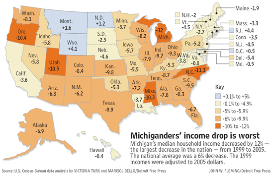
the detroit free press had a nice labor day piece on median income in michigan and the united states, which included this [pdf] graphic of state-by-state data. since i’m not sure how long that will remain, i present a smaller version here:

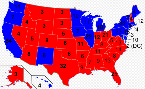
and, for your convenient reference, the 2000 presidential election results:

great disucssion over here on the map. ladies and gentlemen, let the partisan fur fly.
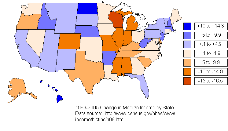
update 2006.09.08: Based on a tip from jane galt via creative destruction, this map needs some help.
one thing that did concern me was the strange threshholds for the colors (that odd -5 to -5.9% gap), but that wasn’t really the point. the point was something more like the big economic picture across the country under this “republican” administration. anyway, since i now know i’m hosting bad data, it’s on me to fix the data, and while tables are great for economists and statisticians, i’ve got two maps on this page already. so here’s your new map (pardon the quick-and-dirtyness of it all):

enjoy.
update 2008.08.04: Salon wanted a 2000 presidential election map, and they picked the one used in this post (despite it being a real hack job). welcome Salon readers. enjoy your visit. feel free to look around…