We know better, and do worse
It’s taken a very, very long time for me to settle into a concise understanding of the times we live in 2026…. and it’s awful.
This site is currently broken
It’s taken a very, very long time for me to settle into a concise understanding of the times we live in 2026…. and it’s awful.
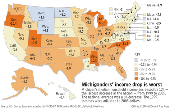
the detroit free press had a nice labor day piece on median income in michigan and the united states, which included this [pdf] graphic of state-by-state data. since i’m not sure how long that will remain, i present a smaller version here:
and, for your convenient reference, the 2000 presidential election results:
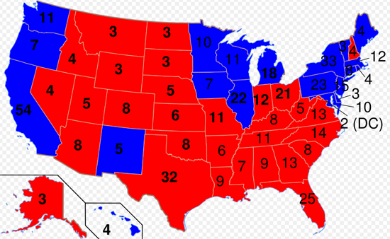
great disucssion over here on the map. ladies and gentlemen, let the partisan fur fly.
update 2006.09.08: Based on a tip from jane galt via creative destruction, this map needs some help.
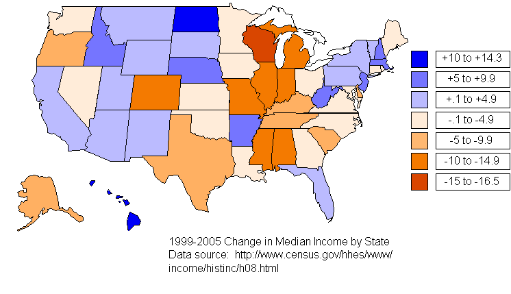
one thing that did concern me was the strange threshholds for the colors (that odd -5 to -5.9% gap), but that wasn’t really the point. the point was something more like the big economic picture across the country under this “republican” administration. anyway, since i now know i’m hosting bad data, it’s on me to fix the data, and while tables are great for economists and statisticians, i’ve got two maps on this page already. so here’s your new map (pardon the quick-and-dirtyness of it all):
enjoy.
update 2008.08.04: Salon wanted a 2000 presidential election map, and they picked the one used in this post (despite it being a real hack job). welcome Salon readers. enjoy your visit. feel free to look around…
i promised i’d address this at some level, so… here we go:
recently, the kansas city star came out with a story about hot fuel. their conclusion:
An investigation by The Kansas City Star has found that at recent prices U.S. consumers are spending about $2.3 billion more for gasoline and diesel this year than they otherwise would if fuel pumps were adjusted to account for expansion of hot fuel.
this story gets some traction, and there are others, like this one from the arizona republic, and follow-ups from the kansas city star here.
of course, this is just physics. things generally expand when they get hot. you’re buying a gallon of gas when you buy a gallon of gas, and not some specific number of joules (like 132,000,000). and all that makes perfect sense back when gasoline turned into the mainstream transportation fuel.
so it’s an engineering legacy that we have to live with, but not indefinitely.
today, it’s the subject of government investigations (see here and here for starters).
so, while everyone is chewing on this multi-billion-dollar heat surcharge collected by the oil industry, i have a couple other concerns to throw into the fire. this little tidbit of government-corporate partnership that brought you a 60-degree standard temperature for gasoline in the united states was established “nearly a century ago” in an era when government was… well, different. more transparent? less? it’s hard for me to judge. but what i do know is that today, the oil industry is not just agreeing to standard temperatures for measuring gallons of gasoline. they’re setting energy policy, behind closed doors, with an administration that won’t even disclose what subjects are being discussed. those investigations have been completely stonewalled.
so, missouri and california may lead us to a path of temperature-compensating fuel pumps, but will we figure out what other little deals and policies have been established in this business? did someone cut a deal to measure hydrogen by volume as opposed to by joule?
coffee’s not my thing, but it’s good to try make a difference sometimes, so here’s my 200-character (1/100th of a cent per character?) push at costa to go all the way with their fair trade commitment.
in that british way, the economist has news on the eclipse of the dollar – unfortunately, it’s a print thing, so i can’t link to it. but i can share the teaser from their “premium content”:
In December, we warned that the dollar’s role as the world’s main currency was under threat if America continued in its profligate ways. Yet the dollar has been dethroned even sooner than we expected. It has been superseded not by the euro, nor by the yen or yuan, but by another increasingly popular global currency: frequent-flyer miles.…
fortunately, in this vastly-connected media world, you can catch a re-interpretation of that at the guardian.
Frequent flyer miles soar above sterling [january 8, 2005]By the end of 2004, almost 14 trillion frequent flyer miles had been accumulated worldwide, worth between 1p and 6p apiece.
oddly enough, i happen to know someone that can be held personally responsible for the flood of currency.
i bring this up today, for two reasons… one is to remind (or rather, direct your attention to) the idea of donating frequent flier miles to make a difference.
and the second is to raise the question of the impending “bank failures” in this miles-economy as american airlines all fight to drive themselves out of business.
two stories crossed the ap wires recently, and being the kinda person that synthesizes stuff all the time, they just begged for a little calculation…
last came the news today about the wealth of bin laden and in that the cost of the september 11 attacks.
the attack’s price tag of just $400,000 to $500,000 over two years.
a couple weeks ago, there was a story about the top insurance companies losses, related to an expected double-whammy hurricane action going on in florida, that included this:
Terrorist attack (New York, Virginia, Pennsylvania), September 2001 – $20.7 billion.
that’s a ($20,700,000,000 / $500,000) = 41,400-fold multiplier.
just a comment now that i have a figure on it… you can’t beat that with an army. bush was closer to the truth than maybe even he realized.
thumbing their nose at american economist benjamin “time is money” franklin, researchers at the university of washington and the wharton school have published a paper, Spending Time Versus Spending Money [pdf] that seems to contradict the conventional wisdom.
erica okada and stephen hoch prepared the paper back in may of 2003.
Although we agree that an understanding of the opportunity costs of time is important to making good decisions, in this research we find systematic differences in the way that people ex ante spend time versus money and ex post differences in how they evaluate decision outcomes experienced after spending time or money.
translation: people have a pretty solid idea of what money is worth, but we’re a little flexible when it comes to deciding what time is worth.
this, of course, has immediate ramifications when it comes ot the concepts i’ve dragged through this blog in a thread about attention markets and the constraints thereon. you’ll find echoes of this over at barry’s blog as well, as we both bounce around theories and comments on the subjects of falling tv ratings, collapse of the music business, and other such things.
just for the record, because i have a blog, my time is worthless.
first, i want to congratulate all the olympians before i spend a few minutes dissecting their event. so, congratulations olympians, and thank you to greece for hosting.
a while ago, i ran into the australian bureau of statistics’ medal count per population table. they’ve updated it with the final tallies, and it’s an interesting perspective on the olympics. it also gave me a crazy idea to go another direction. i don’t pretend to have the resources of the abs, but i do have a spreadsheet application and a web browser, so what i’ve done is combine the 1999 gross domestic product data (which seems to be the last year for which pretty much every country is represented) with the official medal tally from the 2004 athens summer games. doing that gives me a “gdp per medal” figure that looks something like this:
Rank | NOC | NOC Name | Gold | Silver | Bronze | Tot. | Aggregate Medal Value | 1999 GDP | GDP per Gold | GDP per Aggregate | |||
4 | GEO | Georgia | 2 | 2 | 0 | 4 | 10 | 2.74 | 1.37 | 0.27 | |||
5 | BLR | Belarus | 2 | 6 | 7 | 15 | 25 | 11.56 | 5.78 | 0.46 | |||
6 | ETH | Ethiopia | 2 | 3 | 2 | 7 | 14 | 6.54 | 3.27 | 0.47 | |||
7 | AZE | Azerbaijan | 1 | 0 | 4 | 5 | 7 | 3.77 | 3.77 | 0.54 | |||
8 | UKR | Ukraine | 9 | 5 | 9 | 23 | 46 | 30.76 | 3.42 | 0.67 | |||
9 | ERI | Eritrea | 0 | 0 | 1 | 1 | 1 | 0.72 | n/a | 0.72 | |||
10 | BUL | Bulgaria | 2 | 1 | 9 | 12 | 17 | 12.71 | 6.36 | 0.75 | |||
11 | LAT | Latvia | 0 | 4 | 0 | 4 | 8 | 6.26 | n/a | 0.78 | |||
12 | JAM | Jamaica | 2 | 1 | 2 | 5 | 10 | 7.93 | 3.97 | 0.79 | |||
13 | KEN | Kenya | 1 | 4 | 2 | 7 | 13 | 10.38 | 10.38 | 0.8 | |||
14 | ROM | Romania | 8 | 5 | 6 | 19 | 40 | 34.16 | 4.27 | 0.85 | |||
15 | ZIM | Zimbabwe | 1 | 1 | 1 | 3 | 6 | 5.62 | 5.62 | 0.94 | |||
16 | MGL | Mongolia | 0 | 0 | 1 | 1 | 1 | 0.97 | n/a | 0.97 | |||
17 | RUS | Russia | 27 | 27 | 38 | 92 | 173 | 184.63 | 6.84 | 1.07 | |||
18 | KAZ | Kazakhstan | 1 | 4 | 3 | 8 | 14 | 15.62 | 15.62 | 1.12 | |||
19 | BAH | Bahamas | 1 | 0 | 1 | 2 | 4 | 4.56 | 4.56 | 1.14 | |||
20 | HUN | Hungary | 8 | 6 | 3 | 17 | 39 | 48.4 | 6.05 | 1.24 | |||
21 | EST | Estonia | 0 | 1 | 2 | 3 | 4 | 5.14 | n/a | 1.29 | |||
22 | LTU | Lithuania | 1 | 2 | 0 | 3 | 7 | 10.65 | 10.65 | 1.52 | |||
23 | SVK | Slovakia | 2 | 2 | 2 | 6 | 12 | 18.84 | 9.42 | 1.57 | |||
24 | UZB | Uzbekistan | 2 | 1 | 2 | 5 | 10 | 16.4 | 8.2 | 1.64 | |||
25 | CRO | Croatia | 1 | 2 | 2 | 5 | 9 | 20.18 | 20.18 | 2.24 | |||
26 | CMR | Cameroon | 1 | 0 | 0 | 1 | 3 | 9.19 | 9.19 | 3.06 | |||
27 | GRE | Greece | 6 | 6 | 4 | 16 | 34 | 125.09 | 20.85 | 3.68 | |||
28 | AUS | Australia | 17 | 16 | 16 | 49 | 99 | 395 | 23.24 | 3.99 | |||
29 | CZE | Czech Republic | 1 | 3 | 4 | 8 | 13 | 53.12 | 53.12 | 4.09 | |||
30 | NZL | New Zealand | 3 | 2 | 0 | 5 | 13 | 53.97 | 17.99 | 4.15 | |||
31 | SLO | Slovenia | 0 | 1 | 3 | 4 | 5 | 21.72 | n/a | 4.34 | |||
32 | MAR | Morocco | 2 | 1 | 0 | 3 | 8 | 35.01 | 17.51 | 4.38 | |||
33 | DOM | Dominican Rep | 1 | 0 | 0 | 1 | 3 | 17.04 | 17.04 | 5.68 | |||
34 | PAR | Paraguay | 0 | 1 | 0 | 1 | 2 | 11.68 | n/a | 5.84 | |||
35 | KOR | Korea | 9 | 12 | 9 | 30 | 60 | 406.94 | 45.22 | 6.78 | |||
36 | TRI | Trinidad/Tobago | 0 | 0 | 1 | 1 | 1 | 6.87 | n/a | 6.87 | |||
37 | CHN | China | 32 | 17 | 14 | 63 | 144 | 991.07 | 30.97 | 6.88 | |||
38 | IRI | I. R. Iran | 2 | 2 | 2 | 6 | 12 | 94.94 | 47.47 | 7.91 | |||
39 | THA | Thailand | 3 | 1 | 4 | 8 | 15 | 123.9 | 41.3 | 8.26 | |||
40 | POL | Poland | 3 | 2 | 5 | 10 | 18 | 154.15 | 51.38 | 8.56 | |||
41 | NOR | Norway | 5 | 0 | 1 | 6 | 16 | 152.94 | 30.59 | 9.56 | |||
42 | CHI | Chile | 2 | 0 | 1 | 3 | 7 | 67.42 | 33.71 | 9.63 | |||
43 | TUR | Turkey | 3 | 3 | 4 | 10 | 19 | 185.21 | 61.74 | 9.75 | |||
44 | NED | Netherlands | 4 | 9 | 9 | 22 | 39 | 394.19 | 98.55 | 10.11 | |||
45 | EGY | Egypt | 1 | 1 | 3 | 5 | 8 | 87.25 | 87.25 | 10.91 | |||
46 | RSA | South Africa | 1 | 3 | 2 | 6 | 11 | 131.05 | 131.05 | 11.91 | |||
47 | AUT | Austria | 2 | 4 | 1 | 7 | 15 | 208.05 | 104.03 | 13.87 | |||
48 | DEN | Denmark | 2 | 0 | 6 | 8 | 12 | 174.28 | 87.14 | 14.52 | |||
49 | SWE | Sweden | 4 | 1 | 2 | 7 | 16 | 238.68 | 59.67 | 14.92 | |||
50 | ESP | Spain | 3 | 11 | 5 | 19 | 36 | 596.71 | 198.9 | 16.58 | |||
51 | SYR | Syrian Arab Rep | 0 | 0 | 1 | 1 | 1 | 16.68 | n/a | 16.68 | |||
52 | UAE | U Arab Emirates | 1 | 0 | 0 | 1 | 3 | 51.89 | 51.89 | 17.3 | |||
53 | NGR | Nigeria | 0 | 0 | 2 | 2 | 2 | 34.78 | n/a | 17.39 | |||
54 | ITA | Italy | 10 | 11 | 11 | 32 | 63 | 1172.51 | 117.25 | 18.61 | |||
55 | INA | Indonesia | 1 | 1 | 2 | 4 | 7 | 154.12 | 154.12 | 22.02 | |||
56 | FRA | France | 11 | 9 | 13 | 33 | 64 | 1437.6 | 130.69 | 22.46 | |||
57 | POR | Portugal | 0 | 2 | 1 | 3 | 5 | 114.02 | n/a | 22.8 | |||
58 | GER | Germany | 14 | 16 | 18 | 48 | 92 | 2114.78 | 151.06 | 22.99 | |||
59 | ISR | Israel | 1 | 0 | 1 | 2 | 4 | 98.86 | 98.86 | 24.72 | |||
60 | GBR | Great Britain | 9 | 9 | 12 | 30 | 57 | 1442.01 | 160.22 | 25.3 | |||
61 | TPE | Chinese Taipei | 2 | 2 | 1 | 5 | 11 | 282.6 | 141.3 | 25.69 | |||
62 | BRA | Brazil | 4 | 3 | 3 | 10 | 21 | 542.01 | 135.5 | 25.81 | |||
63 | CAN | Canada | 3 | 6 | 3 | 12 | 24 | 644.74 | 214.91 | 26.86 | |||
64 | ARG | Argentina | 2 | 0 | 4 | 6 | 10 | 283.13 | 141.57 | 28.31 | |||
65 | IRL | Ireland | 1 | 0 | 0 | 1 | 3 | 94.22 | 94.22 | 31.41 | |||
66 | SUI | Switzerland | 1 | 1 | 3 | 5 | 8 | 259.13 | 259.13 | 32.39 | |||
67 | FIN | Finland | 0 | 2 | 0 | 2 | 4 | 129.83 | n/a | 32.46 | |||
68 | USA | United States | 35 | 39 | 29 | 103 | 212 | 9299.15 | 265.69 | 43.86 | |||
69 | BEL | Belgium | 1 | 0 | 2 | 3 | 5 | 248.73 | 248.73 | 49.75 | |||
70 | VEN | Venezuela | 0 | 0 | 2 | 2 | 2 | 102.23 | n/a | 51.12 | |||
71 | JPN | Japan | 16 | 9 | 12 | 37 | 78 | 4346.93 | 271.68 | 55.73 | |||
72 | MEX | Mexico | 0 | 3 | 1 | 4 | 7 | 483.53 | n/a | 69.08 | |||
73 | HKG | Hong Kong | 0 | 1 | 0 | 1 | 2 | 158.61 | n/a | 79.31 | |||
74 | COL | Colombia | 0 | 0 | 1 | 1 | 1 | 86.41 | n/a | 86.41 | |||
75 | IND | India | 0 | 1 | 0 | 1 | 2 | 438.4 | n/a | 219.2 |
for this table, aggregate medal value is computed as “gold * 3 + silver * 2 + bronze” based on this data. gdp data is sourced from the international monetary fund here. gdp data for cuba, north korea and serbia/montenegro was not available from the same source and is omitted.
Rank | NOC | NOC Name | Gold | Silver | Bronze | Tot. | Aggregate Medal Value | 1999 GDP | GDP per Gold | GDP per Aggregate | |||
1 | SCG | Serbia/Monteneg | 0 | 2 | 0 | 2 | 4 | 0 | n/a | 0 | |||
2 | PRK | DPR Korea | 0 | 4 | 1 | 5 | 9 | 0 | n/a | 0 | |||
3 | CUB | Cuba | 9 | 7 | 11 | 27 | 52 | 0 | 0 | 0 |
there’s some data for people to play with when they want to figure out how efficiently economic productivity is converted into olympic medals. now you have one answer to the question, “what is an olympic medal worth?”
just a little while ago, the census bureau released their annual data on poverty. this “strong” economy has done this:
* The number of people below the official poverty thresholds numbered 35.9 million in 2003, or 1.3 million more than in 2002, for a 2003 poverty rate of 12.5 percent. Although up from 2002, this rate is below the average of the 1980s and 1990s.
* The poverty rate and number of families in poverty increased from 9.6 percent and 7.2 million in 2002 to 10.0 percent and 7.6 million in 2003. The corresponding numbers for unrelated individuals in poverty in 2003 were 20.4 percent and 9.7 million (not different from 2002).
* As defined by the Office of Management and Budget and updated for inflation using the Consumer Price Index, the average poverty threshold for a family of four in 2003 was $18,810; for a family of three, $14,680; for a family of two, $12,015; and for unrelated individuals, $9,393
that’s 12.2% of the population (using the current “population clock” of 294.1 million americans). it’s also more than the total population of canada (32.5 million).
as a note, $9393 a year for an individual, working 2000 (50 * 40) hours a year works out to $4.69, which is just a wee bit below the federal minimum wage.
Income Gap Up Over Two Decades, Data Show [ap via abc news, august 17, 2004]The wealthiest 20 percent of households in 1973 accounted for 44 percent of total U.S. income, according to the Census Bureau. Their share jumped to 50 percent in 2002, while everyone else’s fell. For the bottom fifth, the share dropped from 4.2 percent to 3.5 percent.
just a little data point to add to the thread.
Powered by WordPress